Sign of The Times: Data Visualization Heaven
By Maria Popova
 Newspapers have long been a paradise of visual information — from the early 20th century isotype language pioneered by Otto Neurath, to the elaborate vintage infographics we so love. So imagine our excitement when The New York Times announced Times Open last week, an open API initiative encouraging the development of applications around The Times‘ enormous vault of data.
If you swim in the shallow end of the geek pool, fear not: Here’s the Cliff’s Notes on API — it stands for application programing interface and is pretty much what shapes the behavior of one application as it interacts with others. For example, a WordPress plugin that displays your latest tweets on your blog uses the Twitter API to work the magic.
But what makes the NYT development particularly important is that the API opens up data from the paper’s entire 158-year archive — from the Civil War to the moon landing to the latest Radiohead album reviews — allowing developers and artists alike to do just about anything with it.
And they already are.
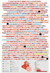
Vancouver-based generative software artist Jer Thorp has done a series of visualizations exploring the social conversation around certain terms as reflected in The Times over the last 27 years.

From the gossip on sex and scandal, to a face-off between the most iconic superheroes, to the increasing anxiety about global warming, the series is a visual documentary of our collective concern over issues big and small, the kind of mundane chatter and momentous movements that define a culture.
San Diego artist and developer Tim Schwartz is digging even deeper with visualizations of history that use The New York Times’ entire 158-year corpus of data. His interface plots terms over time, exploring how the cultural dialog has changed as our society evolves. It’s amazing to think some of our cultural givens were virtually nonexistent less than a century ago — like, for example, homosexuality, practically unspoken about publicly until the 70’s.
But perhaps most fascinating is how this changes and almost reverses the relationship between newspapers and data visualization — traditionally, infographics in publishing are visual representations of extraneous information that complements the newspaper’s depiction of the outside world, its message. This — the visualization of meta-data about the newspaper itself — is pretty much the opposite, an introspective analysis of the medium as it shapes the message.
 If you find yourself intrigued by and drawn to this world of data visualization, do check out this excellent introduction to it, a wonderful find by our friends at BBH Labs.
—
Published March 5, 2009
—
https://www.themarginalian.org/2009/03/05/new-york-times-data-visualization/
—


ABOUT
CONTACT
SUPPORT
SUBSCRIBE
Newsletter
RSS
CONNECT
Facebook
Twitter
Instagram
Tumblr