Cartograms: Making a Point with Distorted Maps
By Maria Popova
 We love maps. And we love data visualization. Naturally, we love cartograms — maps of countries and areas distorted to reflect non-geographic information about them. These representations provide a succinct and visually digestible way to comprehend complex data about the world’s hisotrical, social, political, economic and health reality, among other issues of interest. Today, we look at three particularly eye-opening cartograms that put today’s geopolitical and socioeconomic reality in perspective.
 EXTERNAL DEBT
As the world continues to try to make sense of the full context and implications of the financial crisis, University of Sheffield postgrad Ben Henning took a look at the real dimension of the world’s external debt. The map reflects the ratio of debt to GDP, based on 2010 estimates by the World Bank and CIA.

In case you were wondering — or looking for an economically stable place to move to — that green patch amidst the European redness is Luxembourg, doing even better than the stereotypical financial forerunner in yellow right below, Switzerland.
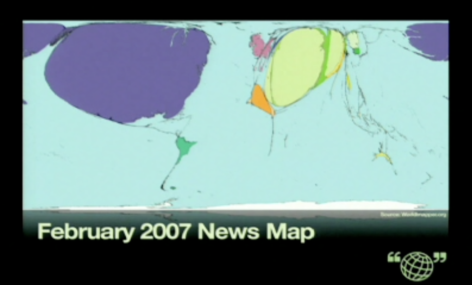
 NEWS
NEWS
There’s no question that news media shape our perception of the world. But, in just four minutes, head of Public Radio International Alisa Miller shows just how distorted the news’ portrayal of the world can be.


Miller’s eye-opening talk embodies the core of why we believe citizen journalism will be a potent game-changer in news, the real “fair and balanced” way to do things.
 POPULATION
Today’s moderately educated adult has no qualms about the world’s overpopulation problem. But this issue is as much one of scale as it is of distribution. Earth’s bloated population, combined with its uneven and disproportionate distribution, makes for a number of social, economic and environmental hazards. This cartogram presents a map of the world, with land areas weighted for population size, making all these disbalances unmissably prominent.

Seeing overcrowded India and China explode while Russia and Canada, with their vast, barren and unpopulated Arctic landscapes, shrink does bring the notion of “public space” to life by visualizing, effectively and powerfully, the relationship between “space” and “the public.”
BONUS
The Daily Mail, a source of otherwise questionable reliability and taste level, has a surprisingly excellent series of cartograms that paint an issue-weighted portrait of the world.

Though three years old, the maps are incredibly eye-opening, reflecting everyting from alcohol consumption to HIV prevalence to toy exports.
—
Published April 15, 2010
—
https://www.themarginalian.org/2010/04/15/cartograms/
—


ABOUT
CONTACT
SUPPORT
SUBSCRIBE
Newsletter
RSS
CONNECT
Facebook
Twitter
Instagram
Tumblr